The Problem
McMashers had a strong in-person vibe and loyal local crowd, but the old website didn’t reflect that energy or help people find key info quickly. Visitors struggled to find the menu, specials like happy hour, daily hours, or contact details without calling or scrolling through social channels. For a place that thrives on casual diners, game days, and walk-ins, that gap meant missed visits and confusion.
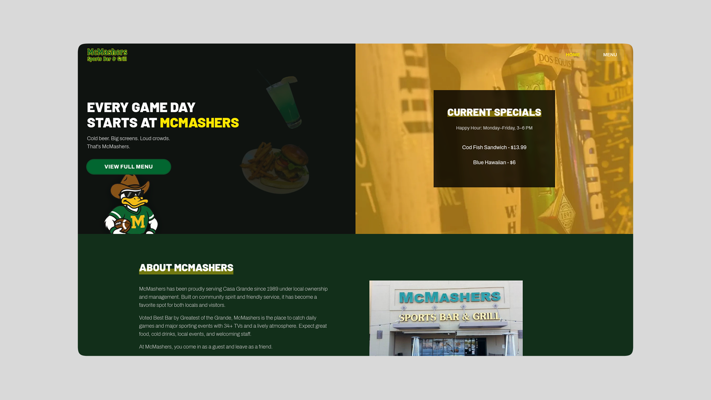
What They Needed
A clean, modern site that:
Showcases the menu clearly so guests can see offerings before they arrive
Highlights hours and specials (happy hour, weekly deals) right up front
Makes it easy to find contact info and location
Reflects the vibe of fun, community, and local pride the bar already had
Solution
We designed a site that’s simple and scannable — the kind of thing you pull up on your phone while deciding where to eat or watch the game:
Straightforward menu page with categories (starters, wings, burgers, etc.) so hungry guests instantly see what’s available.
Specials & happy hour featured on the home page so users immediately know what’s good today.
Hours & contact info front and center so people don’t have to hunt or call.
Visual cues and calls-to-action optimized for mobile, because most diners check restaurant info on their phones.
We kept the design loose and lively enough to match the bar’s personality, not sterile or corporate. The goal wasn’t just “a website,” it was a digital front door that feels as inviting as stepping inside with friends.
Outcome
After launch:
Menu and specials are easy for customers to find without scrolling through social posts or calling.
Browsing is fast on phones, which is where most people search for local spots on the go.
The site now supports walk-ins and first-timers more effectively because key info is clear at a glance.
Owners can update specials and hours without calling a developer.
Even though this wasn’t a conversion-first eCommerce build, streamlining the visitor experience reduced friction and made McMashers more discoverable — a tangible boost in how people find and choose to visit the bar.
Why It Worked
We focused on user goals: “What’s on the menu?” “Are they open now?” “What’s on special?” Answer those instantly and you make the decision to visit much easier. The site now works like a friendly host — it shows up, gets to the point, and makes people comfortable before they walk in the door.